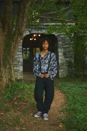
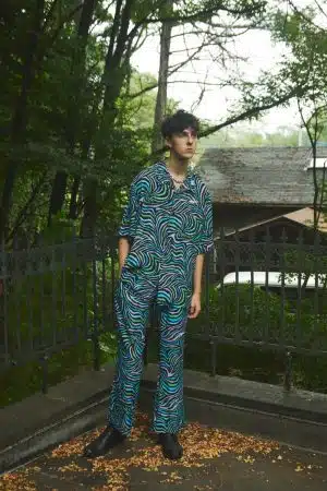
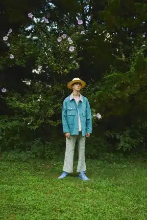
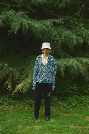
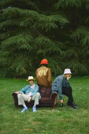
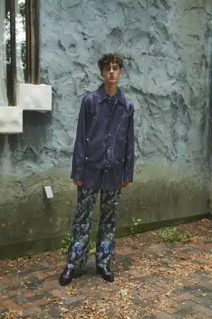
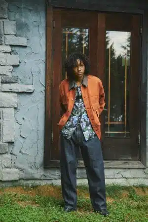
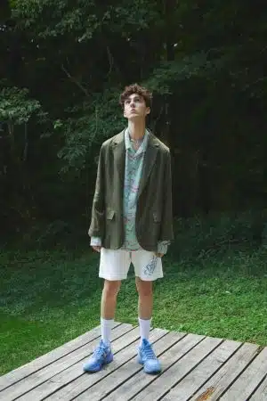
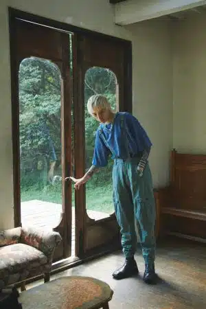
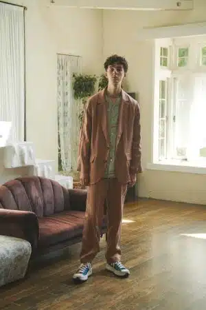
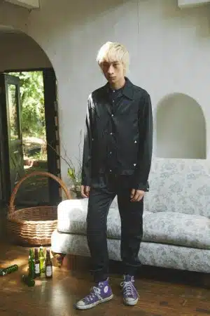
Since 2016, Mihara Yasuhiro and the team behind MYne have focused heavily on music culture while sourcing inspiration for their collections. This time around, the campaign localizes on the scene from the funk of the ’70s and ’80s era. The graphics and fonts that adorn certain pieces are reminiscent of the same typography and designs featured during that time.
Below you’ll find the mainline for Maison MIHARA YASUHIRO; it features the distinctive designs for the brand, characterized by an overall sense of reconstruction through deconstruction and playful techniques. If you’re not familiar with the mainline, I encourage you to Google search the brand, lots of informative sources about them.
Tags: MIHARA YASUHIRO


